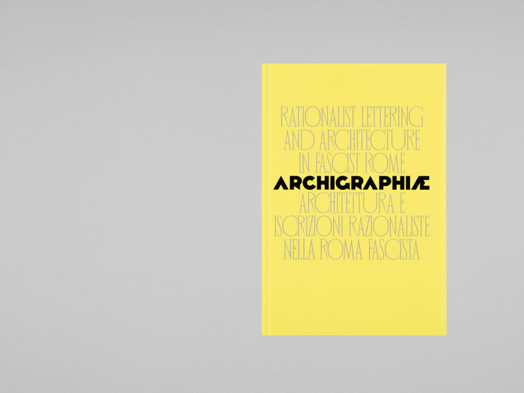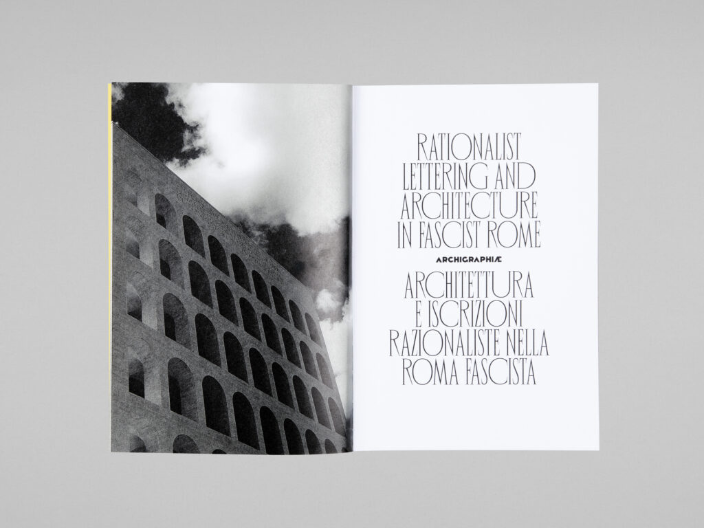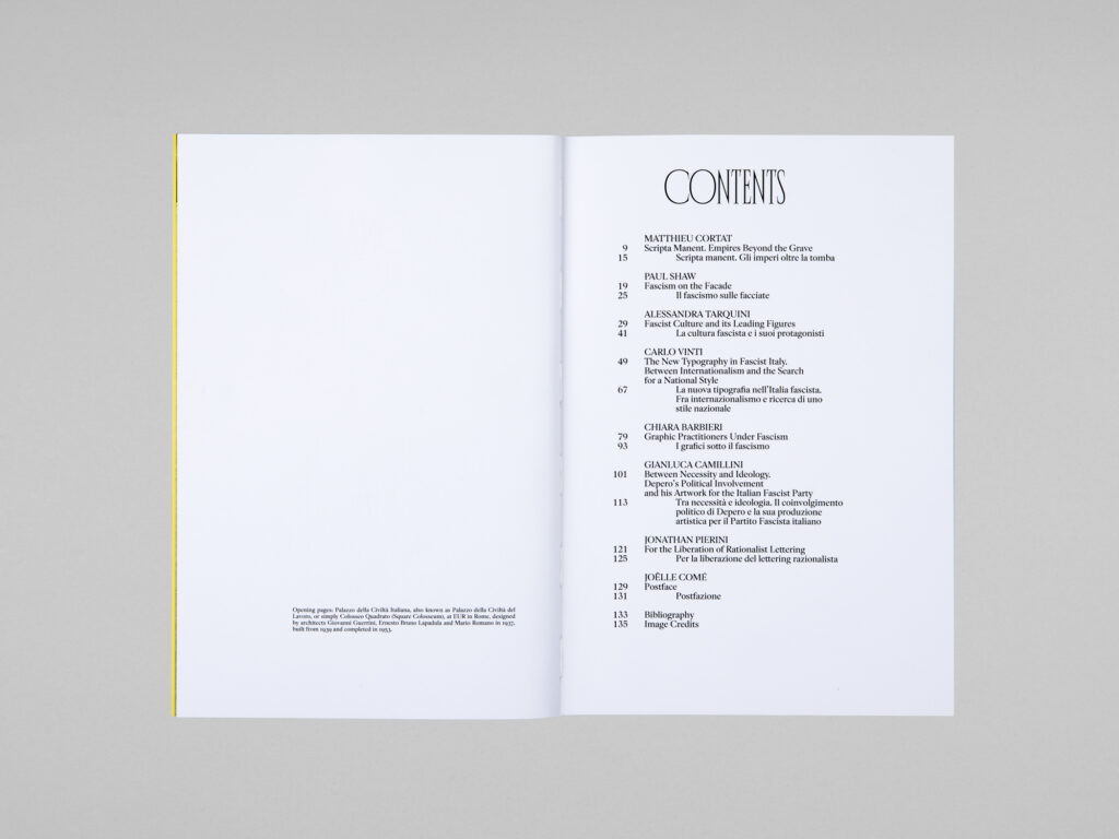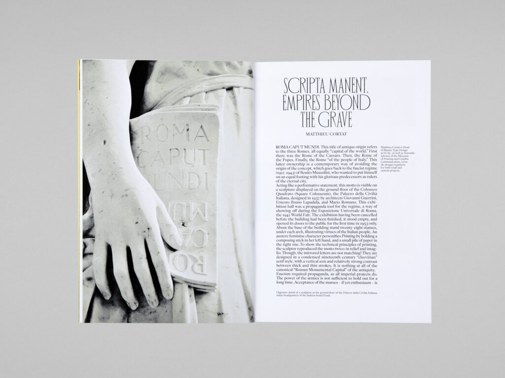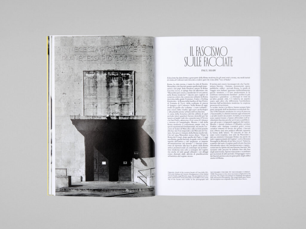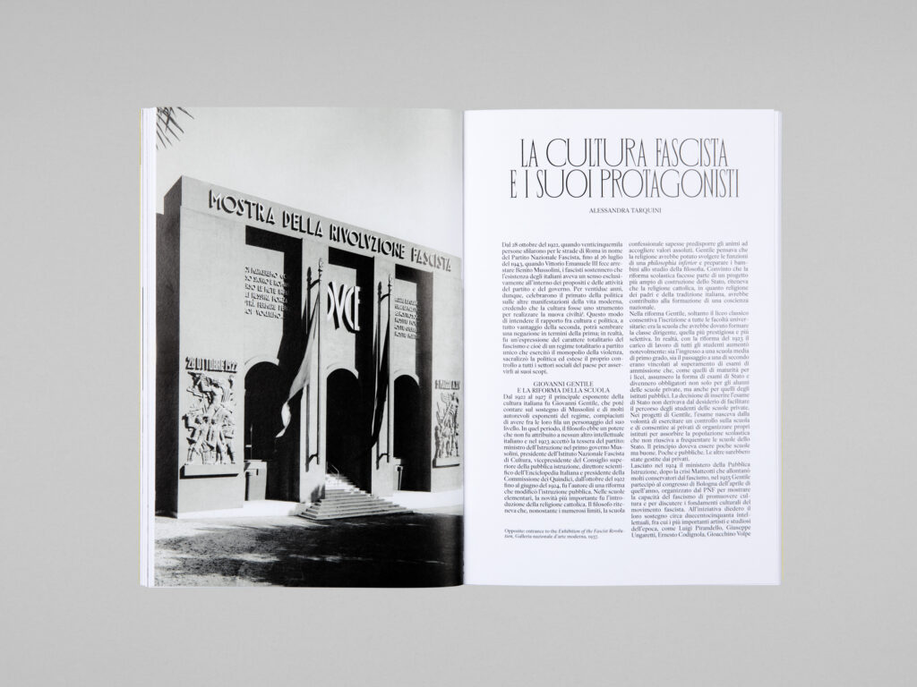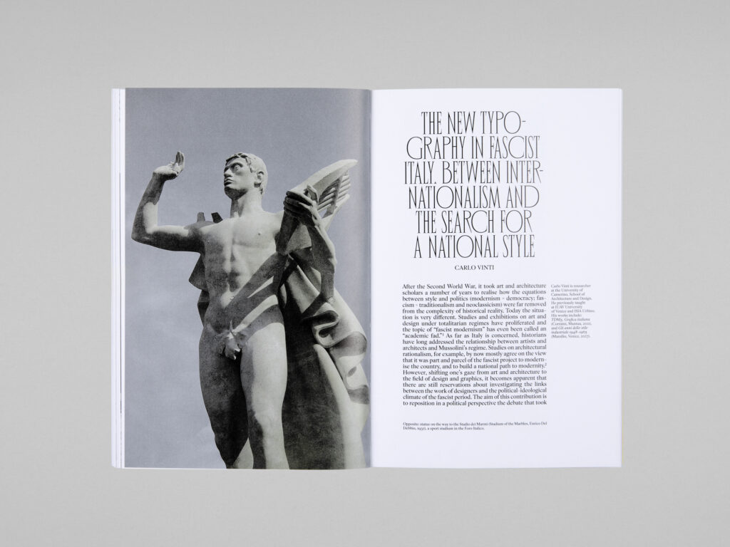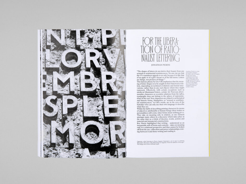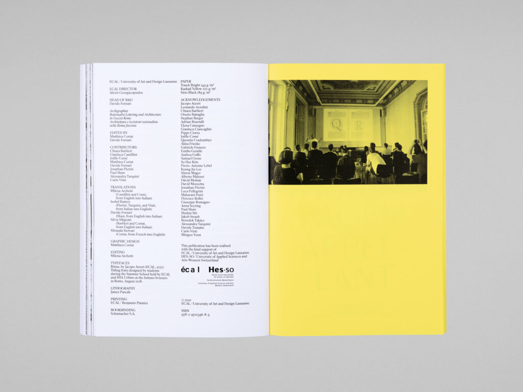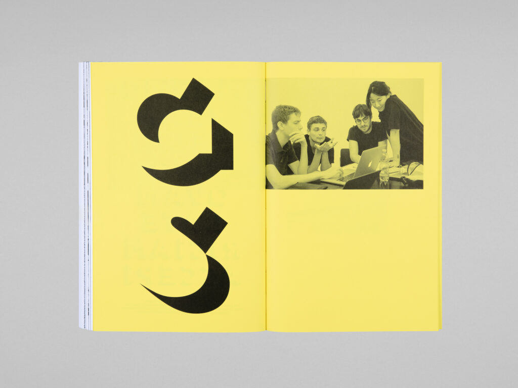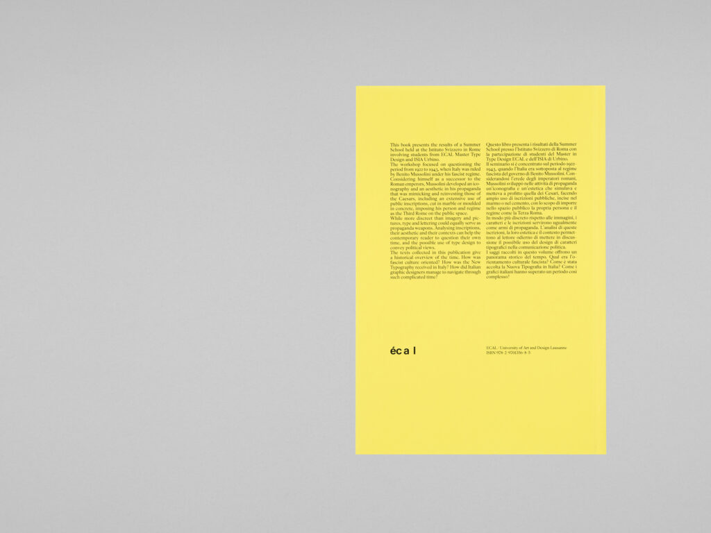
This book presents the results of a Summer School held at the Istituto Svizzero in Rome involving students from ECAL Master Type Design and ISIA Urbino. The workshop focused on questioning the period from 1922 to 1943, when Italy was ruled by Benito Mussolini under his fascist regime. Considering himself as a successor to the Roman emperors, Mussolini developed an iconography and an aesthetic in his propaganda that was mimicking and reinvesting those of the Caesars, including an extensive use of public inscriptions, cut in marble or moulded in concrete, imposing his person and regime as the Third Rome on the public space. While more discreet than imagery and pictures, type and lettering could equally serve as propaganda weapons. Analysing inscriptions, their aesthetic and their contexts can help the contemporary reader to question their own time, and the possible use of type design to convey political views. The texts collected in this publication give a historical overview of the time. How was fascist culture oriented? How was the New Typography received in Italy? How did Italian graphic designers manage to navigate through such complicated time?
Editors
Matthieu Cortat and Davide Fornari
Publisher
ECAL/University of Art and Design Lausanne
Graphic Design
Matthieu Cortat
Contributions
Chiara Barbieri, Gianluca Camillini, Joëlle Comé, Matthieu Cortat, Jonathan Pierini, Paul Shaw, Alessandra Tarquini, Carlo Vinti
Format
16×24 cm, 168 pages
